Maps are perfect for telling you how far away places are, but what about how long it takes to get there? Whether you’re on a bus, in a car, or taking the T, knowing the time you’ll spend getting from A to B is probably more important than knowing the number of miles between them. So when you’re moving someplace new or taking a new job, how can you tell how long your commute will be?
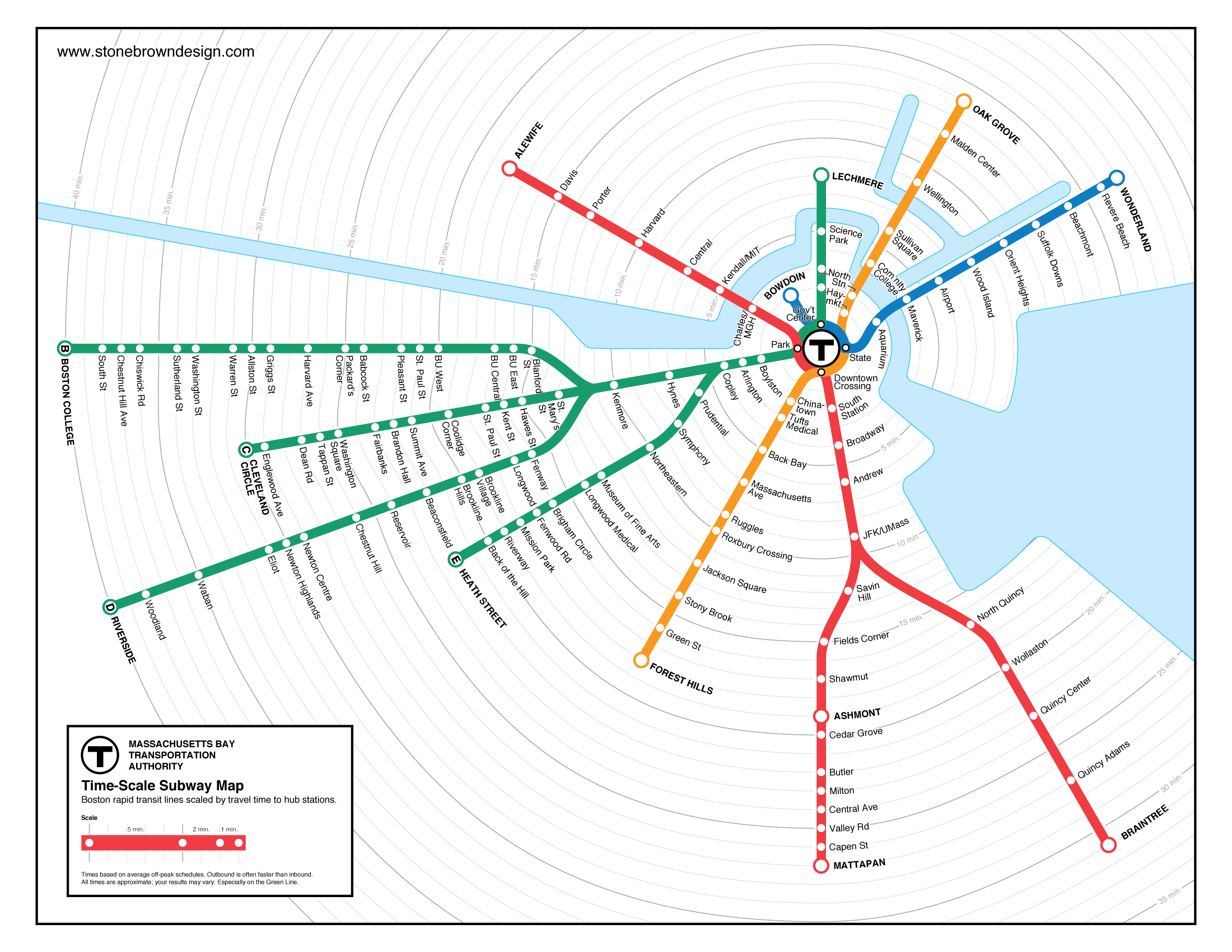
When I first moved to Boston, I made a map that answers that question for the four MBTA subway lines. The T map doesn’t have to be geographically accurate, since subway riders don’t need to know their exact compass direction to navigate the system. I took that distortion a step further by using a time scale: instead of showing how many miles apart stations are, this map shows how many minutes apart they are.

Checking out apartments in the city, I quickly learned that I wanted to avoid the B branch of the green line. In fact, it takes just as long to get to Boston College on the B branch as it does to get to Riverside on the D branch, even though it’s only about half as far away from downtown Boston. There’s no way to see that difference on the official T map.
The time-scale map also shows how much the T is focused on the downtown employment center. The hub-and-spoke system works great if you’re going to one of the four hub stations (Park Street, Downtown Crossing, Government Center, and State Street), but it’s much less helpful if you want to travel around the city without going through it.
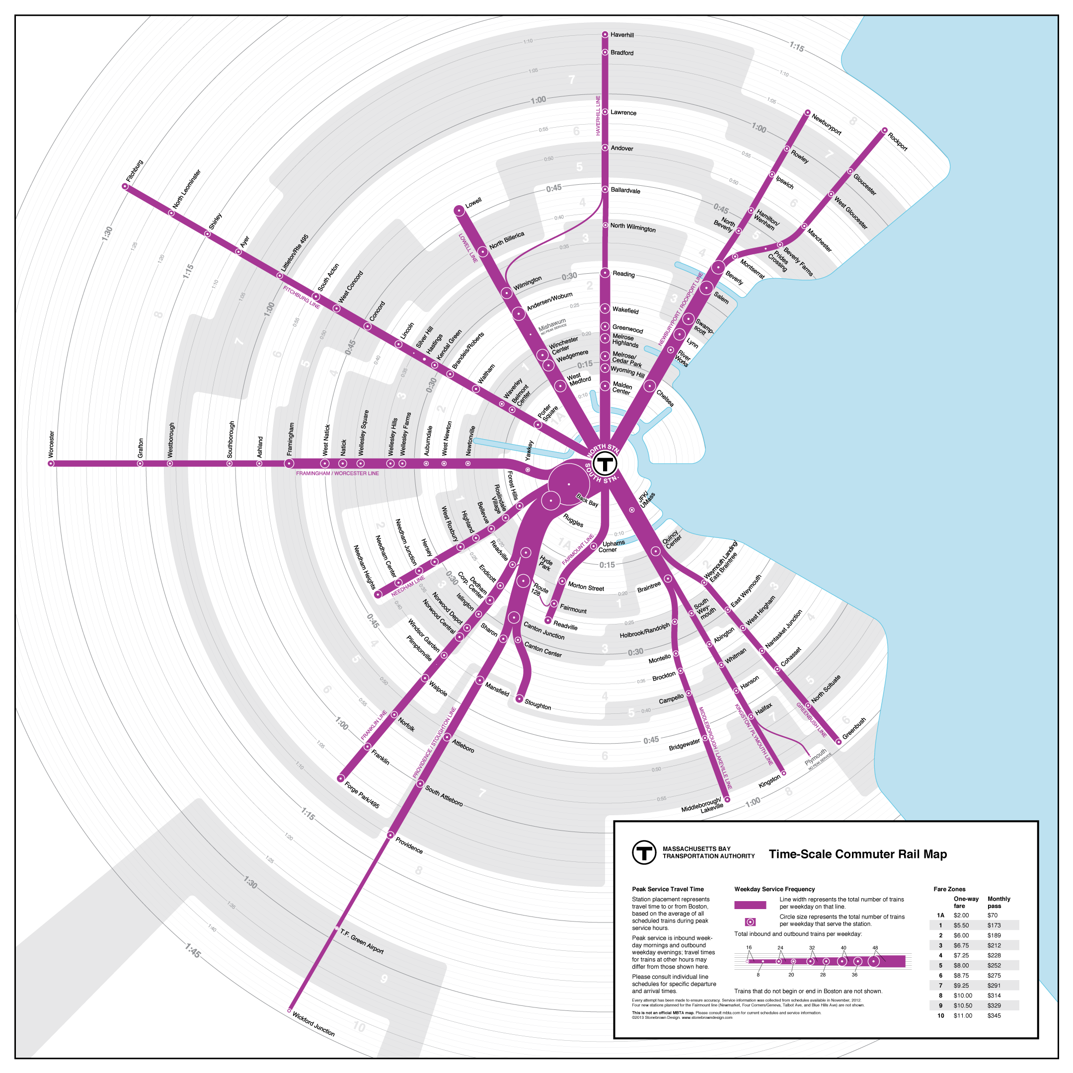
The same is true of the MBTA commuter rail, which brings thousands of workers to central Boston from across eastern Massachusetts every day. Using the same model as the T map, this time-scale map of the commuter rail shows how commuting times compare across the region.
One important piece of information for commuter rail riders is how often the trains come. While on the subway you can show up at any station and expect not to wait too long for the next train, service at the commuter rail stations varies quite a bit. This diagram shows the number of trains per day by varying the size of the station markers and the thickness of the line.
Since schedules vary and any number of factors can affect service on the T, these maps won’t be reliable for detailed planning of individual journeys. But for a general picture of how long commutes are across the region, they’re much more helpful than maps that only show distance.
Read more about the time-scale commuter rail and subway maps on my website.
–Peter Dunn, Municipal Services Specialist at MAPC

