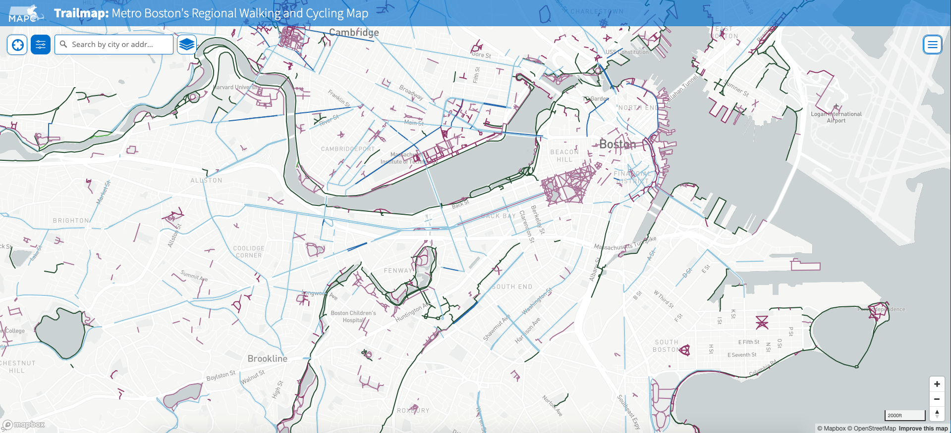
MAPC's Trailmap, the most comprehensive and up-to-date collection of biking and walking trails in Massachusetts, is back in its third iteration.
This new-and-improved version of Trailmap allows users to search by address to find trails near them and provides easy access to detailed maps of foot trails, bicycle facilities, and multi-use paths. Users can see all existing paths and toggle on maps showing paths that are in development.
Most of the trails in the map are in the 101 cities and towns that comprise MAPC’s region. The hope is that cyclists, walkers, and others looking for new trails will use the tool to explore new haunts and plan routes, and make suggestions to include more data in the map. To find out how to access editing functions, email David Loutzenheiser at [email protected].
With this change came the opportunity to respond to user feedback from previous iterations and improve the app organization. In particular, multiple users and focus groups reported that Trailmap’s previous menu of trail groups and colors was overwhelming and confusing.

Re-organizing hundreds of miles of trails and paths into meaningful groups is a challenge. How can we accessibly differentiate the groups from one another? A roadblock like this does not have a cut- and- dry solution; rather, the answer lies somewhere in the middle of a high-wire balancing act of concerns:
- We want enough groups so users can differentiate trail types, but not so many that it is difficult to keep track of what the groups signify. A legend should provide clarification with a glance; it is not meant to serve as a study guide.
- We want to provide a variety of basemaps so users can customize their experience to fit their needs, but also not add so much color and texture complexity that trails don’t “pop” on some maps.
- We want to follow the spirit of traditional trail map colors, but also to ensure that the colors we use are accessible to people with different types of colorblindness.

MAPC's digital services team used the challenge as an exercise in color theory, choosing a base map that wouldn't create confusing visuals and testing color palettes to make sure they were useful to users with colorblindness.

Read about the full process on the Data Services team's Medium blog: "A Study in Magenta: Color Accessibility in MAPC's Trailmap" by Annabelle Taylor Thomas.
